CAGD 270
3D Level 2 v1 Feedback
I’m really happy with how my level turned out this time around. I was, for the most part, able to predict how
my players would navigate the space, created three areas that had separate feels based off of only geometry,
and created enough challenge to reach desired engagement without discouraging those players. There were
a number of small things that I noted when observing the playtesting, a couple of bugs were found, but overall
those involved had very positive praise for the level.
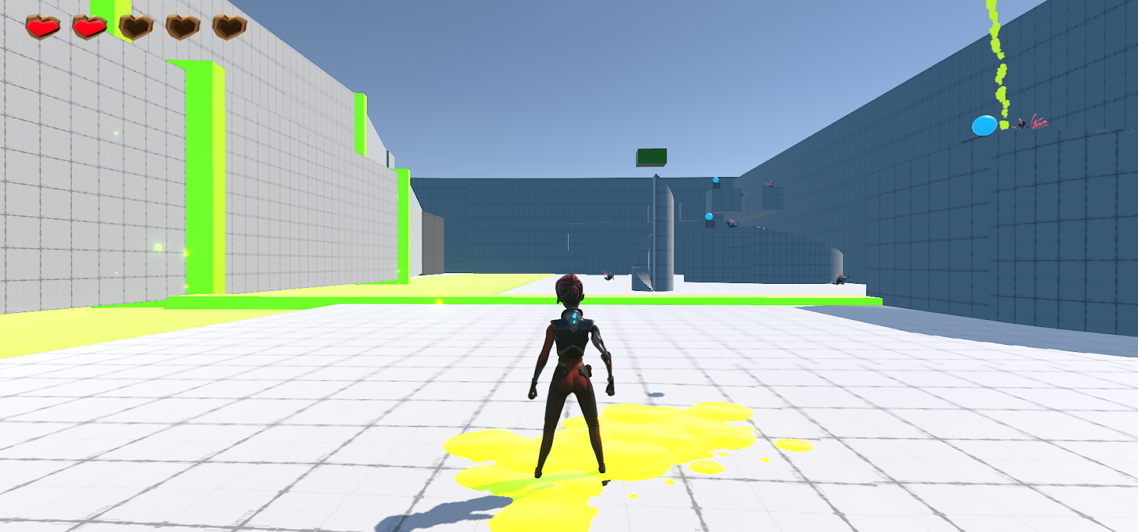
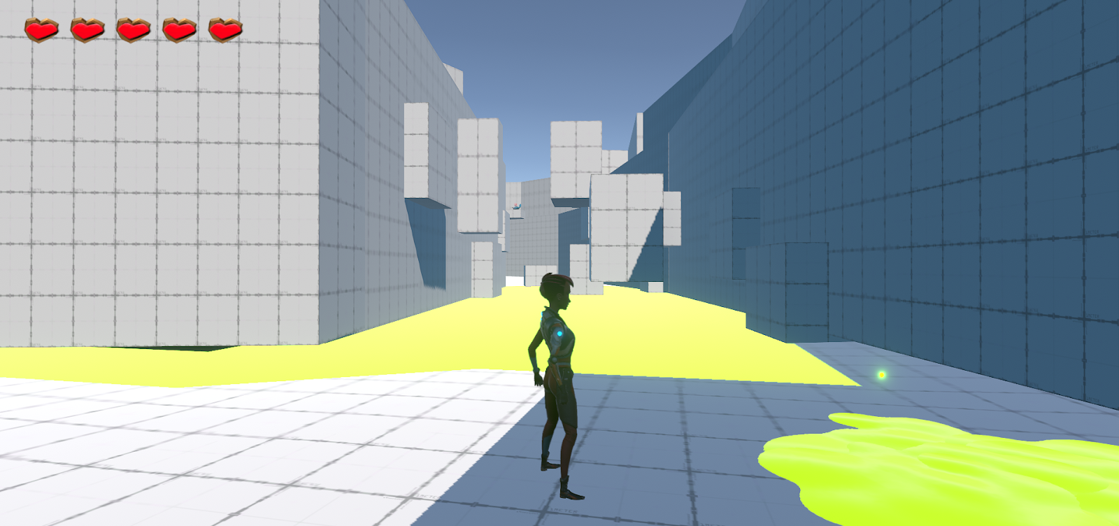
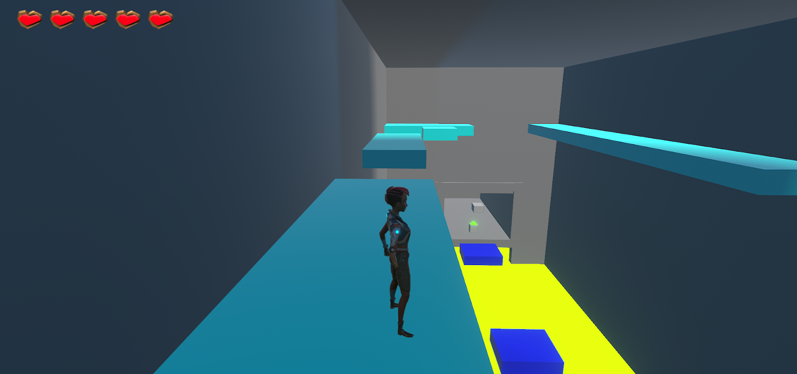
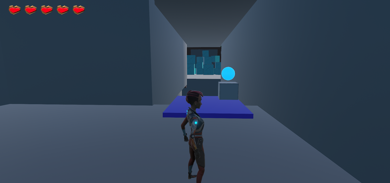
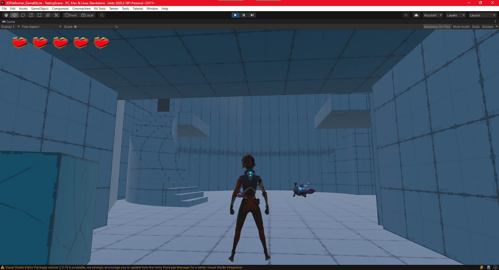
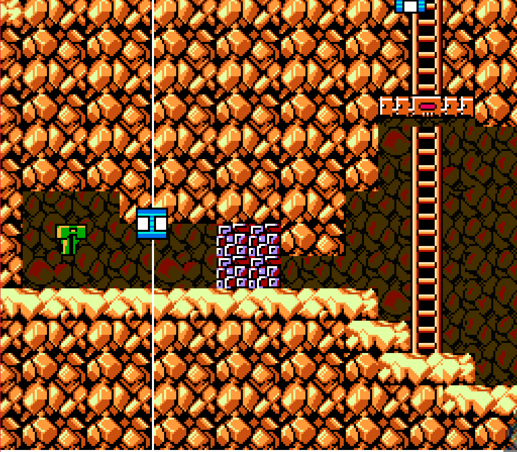
What these many screenshots illustrate was a concept I wanted to nail in this level was the idea of showing the player
exactly what they needed to see. This being the biggest level we’re going to make with a 10-20 minute playtime, easing
player navigation was a high priority of mine. That along with the more open layout of letting the player choose which
paths they want to do, in whichever order, means it’s even easier to make a player lost if I wasn’t careful. In each of the
three level sections I made sure to have the player brought back to the beginning of the level. Additionally, I made sure
the player had a clear view of the crystals they were activating with the switch they were at to help further reduce
confusion and guide the player to move to the next area of the level.
Acid Pools Level Leg
Chomper Chambers Level Leg
Spitter Canyon Level Leg
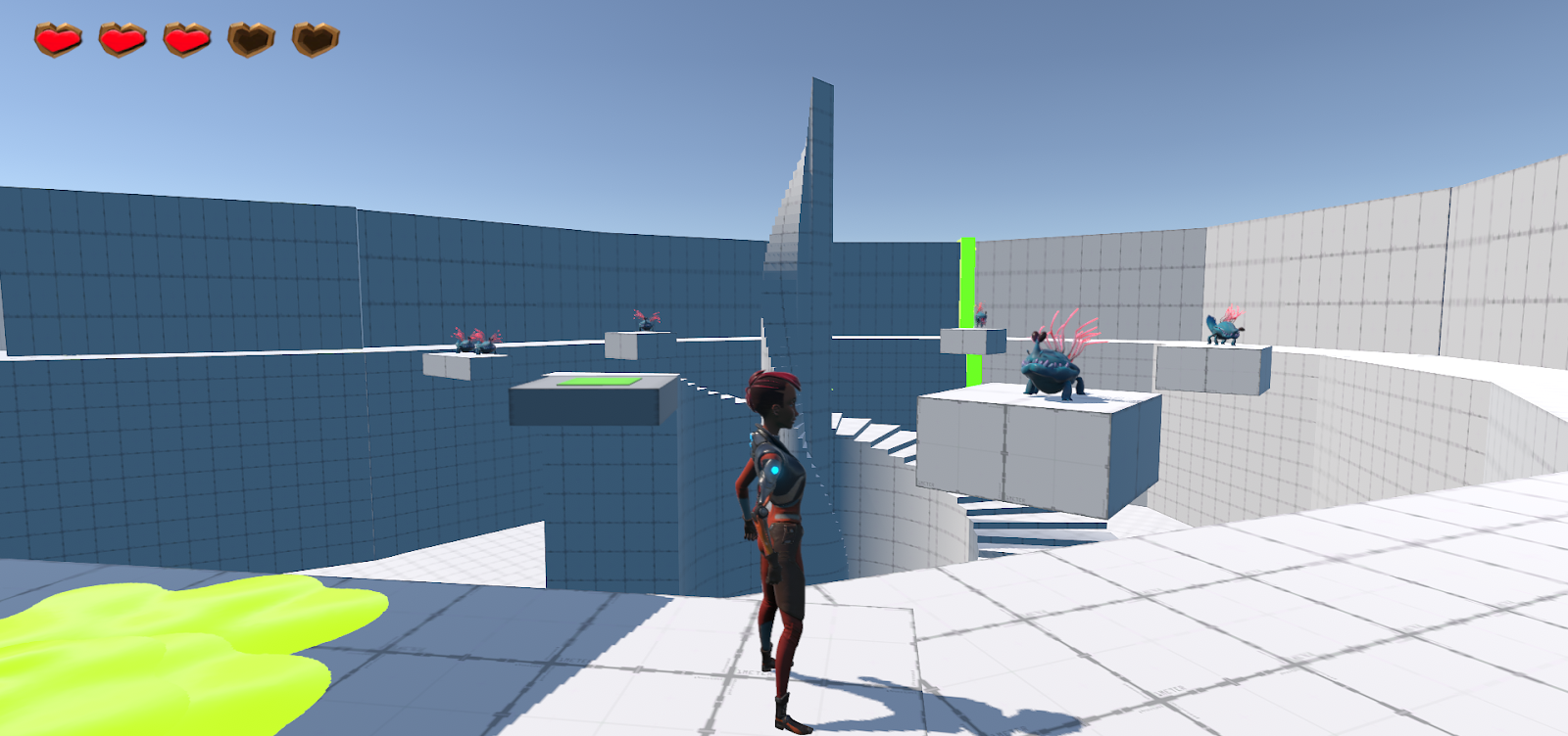
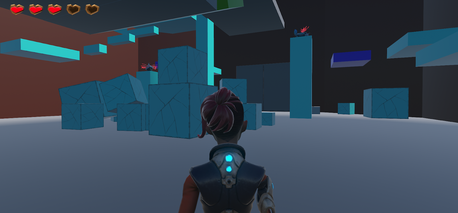
The second aspect I think I did well in was theming each part of my level. Originally I did this simply for aesthetic
and gameplay purposes, making sure I wasn’t repeating the same gameplay over and over. What I did not realize
was that this also helps players in navigating the world. Some of the feedback I got was that this distinction between
areas helped smooth out the transition to different level areas as each leg was easy to remember because of their
particular theme. I’m very happy with how each area came out, how they all worked together to make the level
cohesive, how the gameplay varied from section to section, and that the players felt that as well.
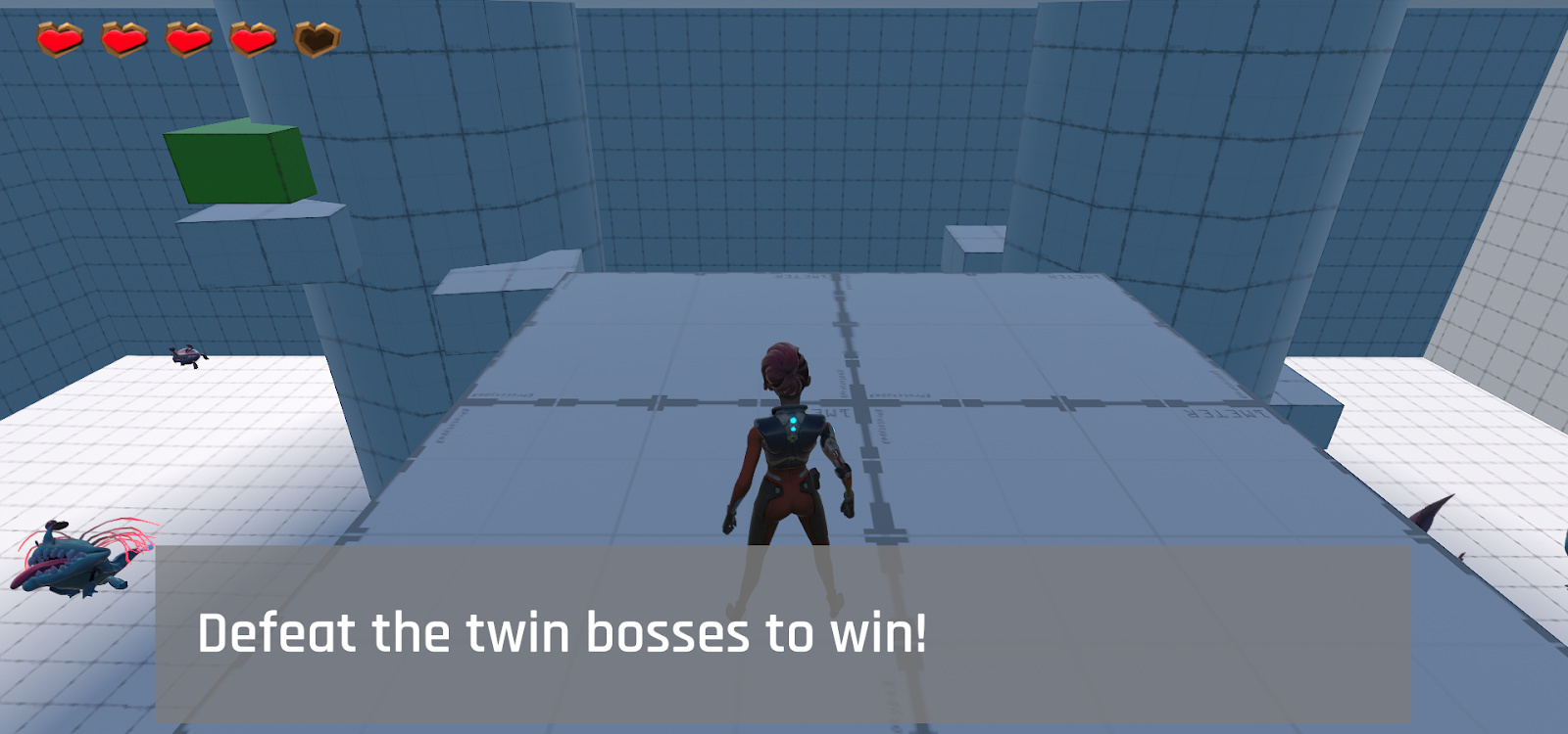
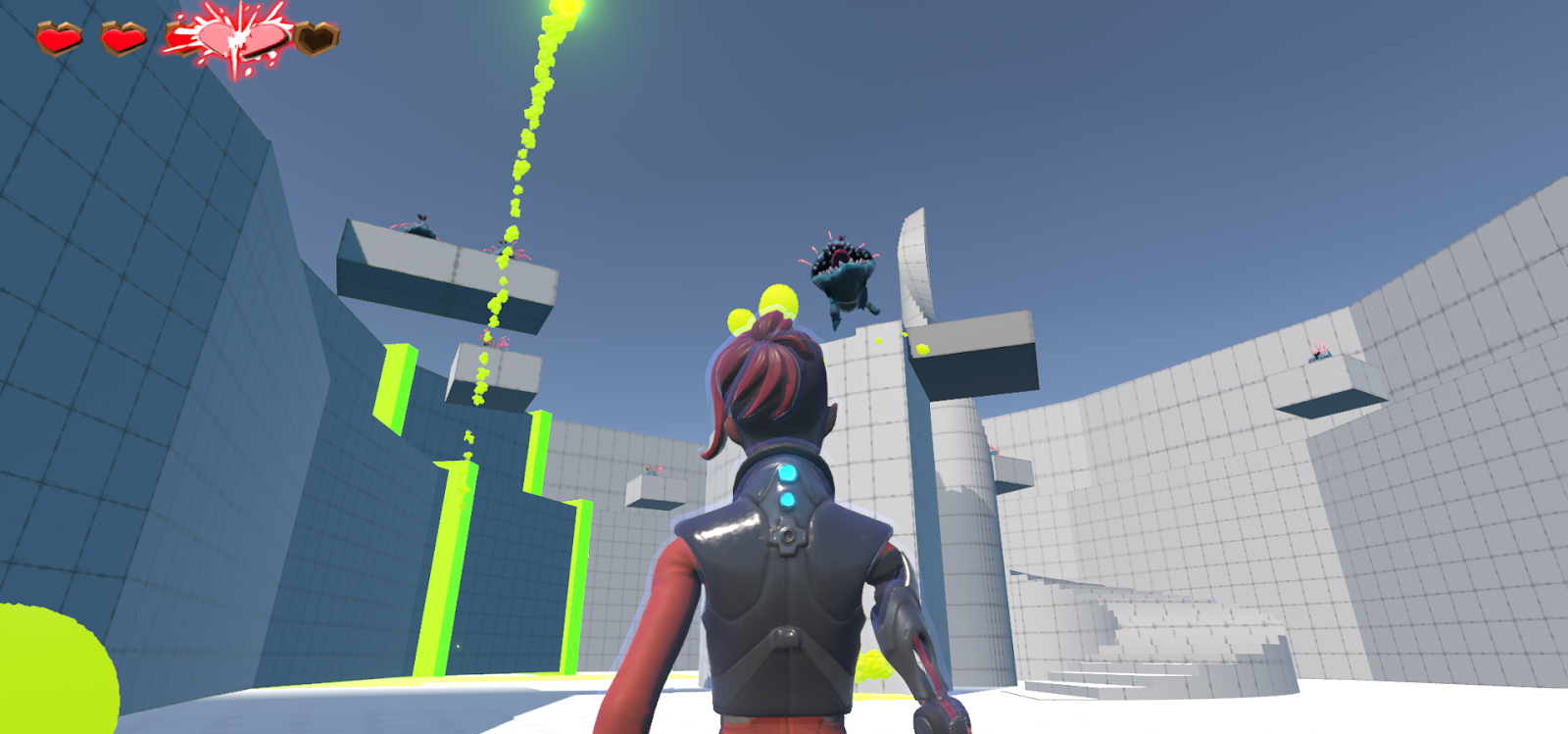
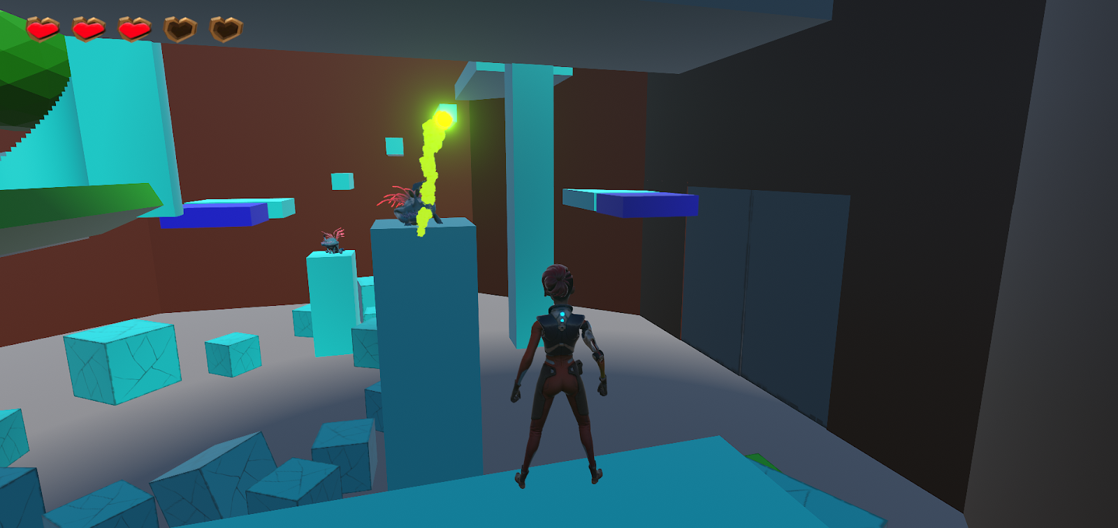
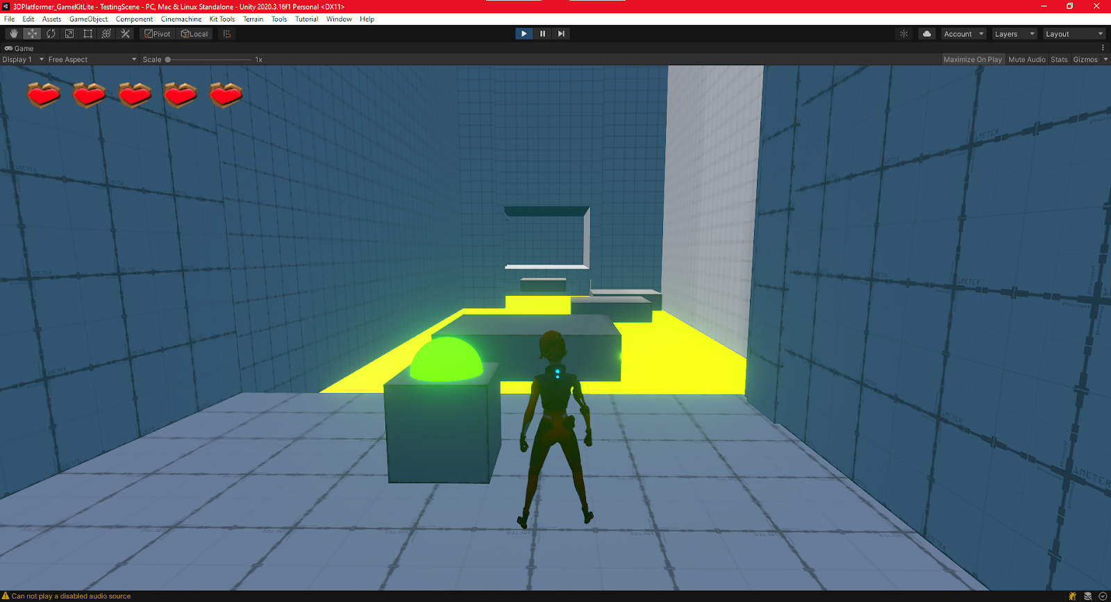
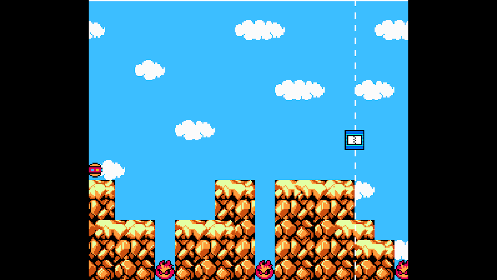
Once the players have flipped all three switches they are then allowed into the first building they saw and drop into
the boss arena. They’re tasked with killing two boss creatures, one big spitter and one big chomper. I let the player
drop onto an elevated platform before starting the fight, as I felt this gave them a better chance to survey the room
and check out what task was before them. They got a chance to see both bosses, the general number of enemies,
as well as the health crates put high up on the pillars. Even though the combat system in this kit is quite limited, only
allowing the player to really move and hit with a stick, I think this chaotic final encounter worked out amazingly well.
It was scary for those who were fighting in it, but they could also get out of the action by jumping up to the health
crates before diving back into the fray. I think in this sense the battling worked out perfectly, where players would get
low on health, go get some, then come back and fight more.
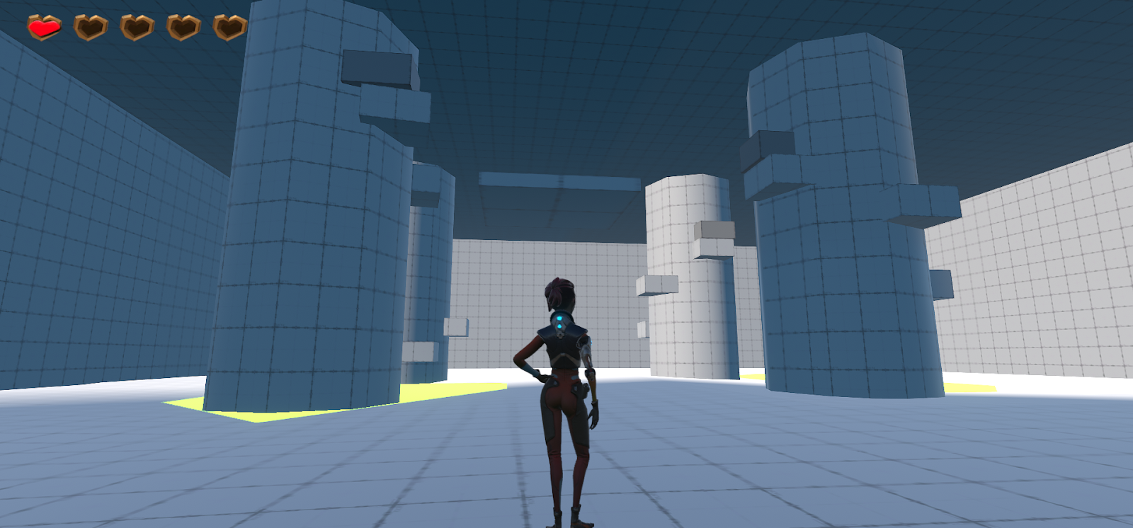
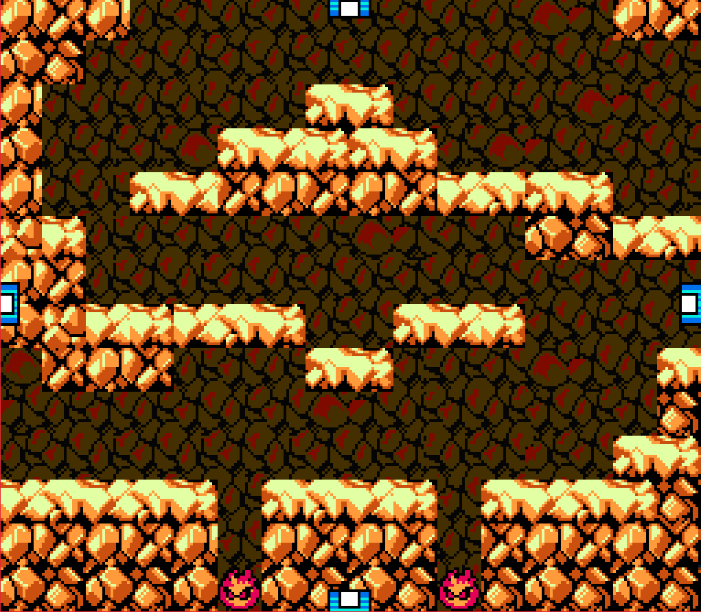
The level was not without its issues though. While for the most part the level played as intended and was still fun for
everyone involved, there were some limitations with the kit that got annoying, as well as some level geometry that I
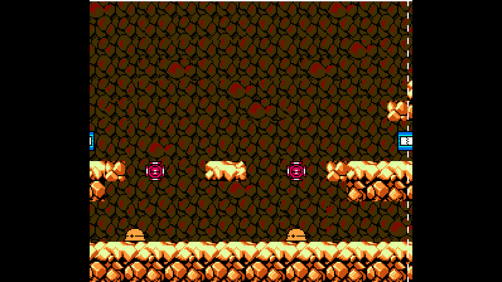
didn’t adjust quite right. The first picture shows how you can get on top of the walls in the Chomper Chambers. This
allows access outside the map and can also get the player stuck. There was another instance of this in the Acid Pools
area. There are also some spots where the walls don’t quite come down in contact with the ground like they should.
This didn’t affect gameplay as much as it was aesthetically distracting. The third (which I couldn’t really get a screenshot
of) was a bug with how the spitters work. For some reason, when you scale a spitter to a larger size, they shoot projectiles
that get bigger with every time they attack. This results in them making attacks that are so big that they collide with the
first piece of geometry they find as well as stutter the player and make the lighting flash as a projectile the size of a small
moon gets shot from them. I decided that the enemies were fun enough that I wanted to leave them in, even if they didn’t
function all too well, as the variety in health and size was appealing.
3D Level 1 Version 2 Feedback
I’m really happy with how this second version of my level worked out. I think I not only achieved slowing down the player, but did so while providing an engaging experience and throwing in my own bit of flair here and there. The feedback on the level was majority very positive with players enjoying the platforming and combat sections.
Additionally, while I didn’t get any comments about it, I did add colors to the objects in the environment in order to make them more visually appealing and help to better match the theme of sci-fi jungle.
I overhauled the jumping puzzle room in order to make it a more distinct section of the level as well as add more engagement. I not only added more moving platforms, but also changed the player path to wrap around the top of the corridor before finally descending on the final platforms. Despite making the player turn completely around, the playtesters didn’t get confused here, and understood the path they needed to take. As well, players seemed to really enjoy the space being given a new dimension with the added high-up walkway circling backwards. There was one bug found by a playtester that a smaller section of wall hadn’t been made solid and could be jumped through, but it was not obvious and only was found after extensive playtesting. That being said, that will have to be patched up but overall, the room was very much a success.
Turning towards the final room I changed the path to be a one-way moving platform over some acid. With adjustments I had made to the final room, as well as there being a new boss enemy introduced, I needed to make sure the player never retreated back down the hallway and lose out on the fun of the room. This also made sure that the player could be well assured that their exit had to be found in that room.
Something devilish I thoroughly enjoyed was the implementation of the boss in this room. I blocked sight of him with all the breakable blocks stacked in front of him and also didn’t bake them into the nav mesh (ensuring the boss would run straight through them). Then I made sure he wouldn’t aggro the player until they had gotten off the platform and stepped into the room. Then with the small delay time of him being alerted and then moving to and knocking over the breakable blocks, he would surprise the player. This was incredibly effective, and got a good scare out of everyone which made the demon on my shoulder cackle with glee. But seriously, it worked exactly as I had hoped! The player would get frightened, then start quickly navigating the room trying to avoid the boss before finally manning up and fighting the boss and killing it. It really brought the player into the space and took it past a simple playtest.
The rest of the boss room involved a bit of platforming that moved the player around the room, climbing up to defeat a horde of enemies, before finally coming down to flick the switch and open the door. This unintentionally used a bit of horseshoe design as the platforming forced the player in a half-circle around the back end of the arena. This not only made sure the player saw the exit doors, but also the switch that controls them if they didn’t notice them while running around fighting the boss monster. The repeat of the horseshoe design (that also happened in the platforming room but was less needed) was commented on by one playtester who appreciated it from an art standpoint, saying that they appreciated that every angle of the room was going to be looked at, and thus art assets could be appreciated no matter where they were put in the room.
3D Game Kit Level 1 Feedback
I think my level went fairly well this time around. I think it was appropriately challenging for a beginner
level, the players played generally how I expected, and there weren’t any glaring, critical failures of
the level design. However, I think there was definitely some improvements that could be made on the
level as a whole.
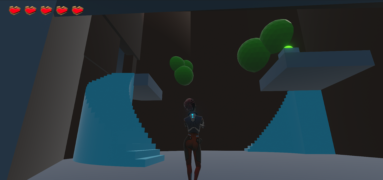
This first room I really liked the design of. The enemies give some interest and the focus. While playtesting, I
had a mix of some players who went toward the stairs on the left and those that went to the stairs on the right.
Either way, the player either richest the door and turns around to find the switch for it, or finds the switch and
watches the door open. Both teach the player about the interaction of switches and doors.
The next room I think did well to not only introduce the new Spitter enemy, but also reinforce the tutorial of
breaking the blocks as was done in the very beginning of the level. It provided a little extra geometry to interact
with and those blocks are placed to be the maximum height that the player can jump.
This platforming section also went pretty well, but the overall section I think was too simplistic. I know it’s
supposed to be an entry level, and supposed to have low difficulty, but it still feels a little too short to get a
full experience out of it. Additionally, I didn’t know how to connect multiple platforms to the same switch, so
I missed the opportunity to pull off the effect of having a nice, easy bridge laid out and having that bridge
break as soon as you press the switch.
The final section of my level I had originally planned to have the enemies on breakable blocks and have the
player break those blocks in order to drop the enemies down and defeat them that way. However, technical
limitations of the game kit kept me from doing that, so I had to adjust my idea. I decided to put them up on
platforms that the player would have to jump up to to destroy the ranged enemies. This room went, alright. It
didn’t seem to be too much more challenging than the rest of the level, and the room was small enough that the
player could actually platform in ways I didn’t expect that seemed to invalidate other parts of the room. I think
moving to the next version, I want to expand this room to be bigger, force the player to do some other platforming
to get to the final columns, and expand more on the gameplay of platforming while ranged enemies are
bombarding you.
Overall, there are a few changes I want to make to the level. The first is that I want to expand the platforming
section to make it more interesting. The second is to expand the final room to be more interesting to encounter,
adding more platforming as well as maybe a boss melee enemy on the ground floor. Lastly, I want to beef up the
melee enemies. I think giving them 2 or 3 hit points instead of the base 1 would make combat with multiple of
them more engaging and force the player to move around more.
Beyond the technical ideas I want to change, I definitely want to provide more materials to the environment to
achieve the jungle theme more. Right now it might be hard to see that I have the first and last combat zones as
giant trees, or that the spaces between are supposed to be scifi bridges. Colors would go a long way to fixing that.
Megaman Level 2 Playtest Feedback
This time around, my level was much less, polished, than it was with my last one. There
were hang ups, awkward portions flow-wise, and a spot where players got consistently
confused. I don’t think it was a terrible level, and in fact, those who played it did say that it
was fun and that they enjoyed it, but I know it could’ve been quite a bit better and more
rewarding to play. I’ll start by pointing out the portions I didn’t like that I thought could use
some tuning up.
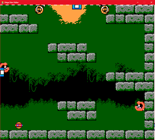
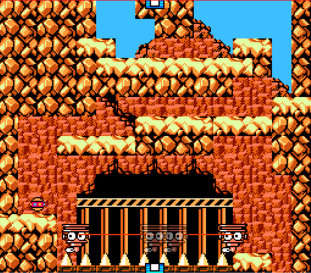
The first room I have shown I had an open wall to the left that I think should’ve been filled in. It looks
like a transition point to another section of the level but is not. It disrupts the level’s flow as the player
attempts to go to a new area just to find that it’s in fact just a wall.
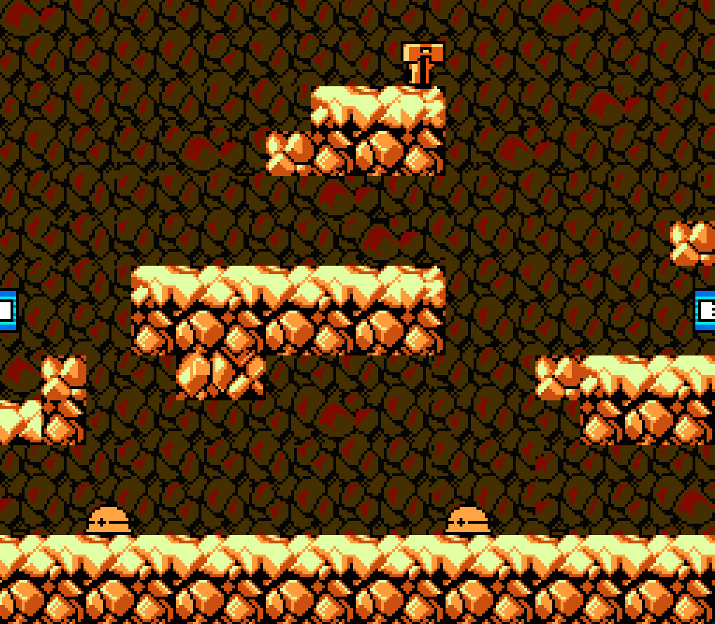
The second screenshot shows an area where I had bullet enemies spawning on both sides. These
enemies, despite how they look in the editor, actually spawn right in line with wherever the player is
at the time. This causes one to spawn right behind the player as they transition into this new zone,
and really feels like a cheapshot.
The third picture shows just above this area. The main gripe I have about this little part is that the
player naturally wants to move up and to the left, as that’s the trajectory they’ve been following, which
leads them to a ledge that leads to nowhere. Just another example of the level’s flow being disrupted,
this time with minor backtracking.
These are, overall, very nitpicky things to critique a level for, but I feel it still ends up negatively
impacting the level. I think these things need to be ironed out in order for a level to move from an
okay/good level, to a great one.
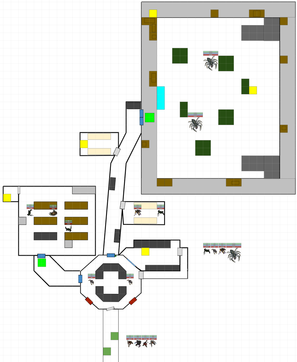
This section had a little bit of a different problem. This is the first cell of the second leg of the level.
The player climbs up to find the new weapon the S.Arrow, and works they’re way back down to this
point through an alternate route. The issue is that by the time players got back to this point, they don’t
recognize it as the beginning of the leg, and move to climb up it again. Partially this is do to enemies
respawning, partially to the length of time between starting the leg and ending it, and partially because
there’s nothing particularly signifying it. There’s the weapon block and the checkpoint, but the blocks
are also the same. I think this would’ve been helped if I had used different bricks in this area, so then
players could see the transition and move on the correct way.
These will be the last of my criticism points. The last leg of the level there are these two cells. Again,
it’s simply a disruption of flow. The first is just awkward. The two skull enemies can’t get to the player
who enters on the right. The player also can’t get to the left side unless they go all the way around and
have no reason to. It really feels like useless space. The second picture I tried making a fun platform
but it ended up also feeling awkward, with the newly changed space not being utilized in any
meaningful way.
There are a couple of things that I did like in however, and I hope I can repeat them in future levels I
create. The first thing that went well was designing sections for the player to navigate later with
different tools. This I did in the first leg of my level, allowing the player to skip over the combat zones
with their newly acquired “Nado” ability.
The second thing I think went well was my final “boss” zone, where the player had both weapons and
fought many enemies while trying to collect the keys they needed to escape. It was just chaotic enough
to make it feel challenging but not so overwhelming as to be frustrating. The players mirrored this
sentiment, saying that the difficulty ramp felt appropriate and fun.
Megaman Intro Level V2 Playtest Feedback
In this version of the level we had a big change in that we were allowed to use keys and doors
in this level. This is a huge change because keys give the player another reason to explore
and interact with the map and the locked doors can guide a player through a level much easier
and with much less confusion. I definitely made use of them, and they helped me to shape
parts of the level that had much less cohesion and flow than before. These factors were felt by
the players in this playtest, as their feedback confirmed things like the vertical platforming and
the mini boss room were much improved.
The first area of the level I focused on was the vertical “mine shaft” section of level, where the
interaction felt clunky and awkward. I tried a number of variations of keeping the level in the
same silhouette, not expanding into any new chunks but doing platforming going down was not
working. So, I switched it up and decided to make it a horizontal platforming section that
extended out into a new chunk. I used spikes and moving platforms in simple ways to help the
player understand these new mechanics and made sure to place a checkpoint right before the
spikes appeared to lower frustration to the lowest amount I could by reducing wasted time. I
decided to also use this area to introduce doors very subtly by forcing the player to collect the
key and open the door just to give them exposure to it. The platforming and the change in size
I think both made this area a much better success and more fun to play.
The second major area I changed was the main mine area. This area was originally difficult
and forced the player to move in strange ways and in some times unable to avoid the enemies.
In this version, I removed the moving enemies and readjusted the terrain so the player could
jump better to avoid enemy shots. I also added a bit more interest in the area by putting a
needed key up at the top of the chunk, giving the player something more to do, and reinforcing
the teaching of how doors work going to the next area. I also decided to use a new key color in
the “secret” area to provide some tension of “where do I use this?” if a player gets into this area.
What I did was provide a green door just before the miniboss room with a lot of healing
available if the player got that green key.
This is a smaller change but the feel of this section is much better now. Before, I had both a
cowboy and the fires moving and players would always be near-panicking when in this section,
and I wanted it to be more interesting than fear inducing. This time around I rebalanced it so
that the player was interacting with just the fireballs and their mechanics and the flow of the
section became much better.
The last major redesign was the mini boss room. Having the gun turrets and the miner in the
same room got to be too chaotic. The difficulty curve was much too high and the players didn’t
feel as good going through it. This time around, the design is much cleaner. There’s keys the
player has to collect in order to get out of the room and the only projectiles are from the miner
enemy. These two sections made for an interesting platform section, but with the addition of the
little enemies at the bottom, scooting around left to right and damaging the player I think hit
exactly the difficulty I wanted to make the room feel like a mini boss. Additionally, players were
much more engaged here, feeling like they could accomplish the goal and have fun while doing
it.
Megaman Intro Level 1 Playtest Feedback
After this first playtest of my Megaman level I’m pretty happy with this first version. I think it did a good job of both teaching the player with skill gates and presenting them with small challenges they could work out. The level flow felt very good, and I think the theming was there as well.
One spot I’m particularly proud of is this one from the very beginning of the level. Up to this point the player has only been tested in jumping and sliding so this is the first enemy. What I like about it, is that the same moment that the player jumps onto the raised platform in the middle is the same time they see that first enemy. That enemy also fires immediately, but the player is sitting just high enough that the bullet can’t reach them, giving them time to see what the enemy does and understand it before going onto the low ground to kill them.
I also liked how this sequence played out. Essentially there are three tiles of this, where fireballs shoot up and rain down from above. The terrain slows the player just enough that it gives them a sense of urgency while also giving them the chance to make it through without trouble if they don’t have to stop at all, which I found very satisfying.
However the level isn’t without its flat sides, whether as a limit of the level editor or by my own design, there are places that could’ve been designed better/cleaned up to make for a smoother, more enjoyable experience.
The first problem child was this section. It was meant to be an interesting jumping puzzle where the player has to time when they go in to avoid the enemies and make their way down 3 tiles of this or so. Unfortunately, it really amounted to being more cumbersome and annoying than interesting. The enemies would make themselves despawn if you waited for them to go off screen, their end points were within jump-shot range, and thus baits the player into waiting for them to come up and frantically jump shooting them to ensure safety, and there’s not enough room to stand between the enemies to feel like you can wait for them to pass and patiently make your way through. All of these are relatively light concerns but I do think it’s something that held back the level from being as good as it could have been. I think in the next version I’ll try to edit this to be a more interesting jumping puzzle by avoiding combat altogether. Maybe make use of the death spikes and moving platforms. But they presents it’s own challenges as it’s difficult to make a puzzle like that seem fair when the player has to move down as opposed to up. I might also try making it a more scenic route down, building up suspense and mystery as they work deeper into the mountain. I think that could work as long as I get the pacing right and make it feel more cathartic than boring after the fireball run.
The second awkward section was right here. It was meant to be more of a challenge to try and push the player’s skills a little more, but the middle platform ended up being more of a trap than a skill test. Players would jump to avoid the meta’s and get stopped short on the block, getting hit with their blasts anyways. I think I could've changed this to be one enemy and a jumping puzzle instead of an onslaught of enemies like it is here.
The final awkward section was right here. This was set up to be a “boss” room of sorts, introducing a new enemy that’s harder than the rest and adding in some extra chaos to make it more boss-like. However, the player can, and wants to, just shoot the enemies in the lower left and get out as opposed to dealing with the mini boss. Additionally, I think the mini boss itself was plenty of difficulty. The turrets on both sides shooting made things a bit too chaotic. In my next version I think I’ll take a suggestion from a pier and place my mini boss blocking the door, and force the player to go up to him and kill him to get through. That should make this encounter flow better, and removing the turrets should bring it back down to intro level difficulty as it should be.


Simple DnD Map V.3 Playtest
The map this time around I can’t say I’m as happy with as I was with my previous map. Yes, it fit into the theme and around the design idea presented but I still didn’t pull off a great experience like I did with the last one. I didn’t get any direct feedback from the players saying that the map was bad or that they didn’t like it, but I could tell they weren’t as excited about it as I got with my last map.
This time around with the theme being a prison break, I decided to make my map play in a much more linear way, slowly equipping and guiding the players as they move along until they reach the final boss room where they can try to fight them or sneak out to the exit. As far as guiding the player I think it went very well. In the first octagon room the players explored all the doors, finding there was one that needed a security badge and another that also needed a keycard. They moved through the door on the right, got the badge, went to the left, got the keycard, and moved up into the boss room. I think the scaling I did with enemy encounters was a bit off too as far as pacing. I started off easy with the little creatures, then ramped it up with three much stronger enemies in the left-side cafe, but then lowered it down to two enemies in the hallway, which I think fel underwhelming.

Additionally, I definitely overstated the bosses at the end of the level. Too much armor and attack for a couple of players capped at 10 HP and limited healing items. They had great effect at creating a danger zone that was to be feared, and they felt like the guardians I wanted them to be, but the players were under equipped to fight it and under-told the idea that stealth was an option.
I think improving this map doesn’t have to come from changing its linear nature. I think that aspect worked out well. The problem is that linear levels are inherently less exciting, because the player quickly realizes they’re being guided on a path. I don’t think I realized this enough, as I needed to create more tension, more drama within that linear structure to give it that spark that it needs.
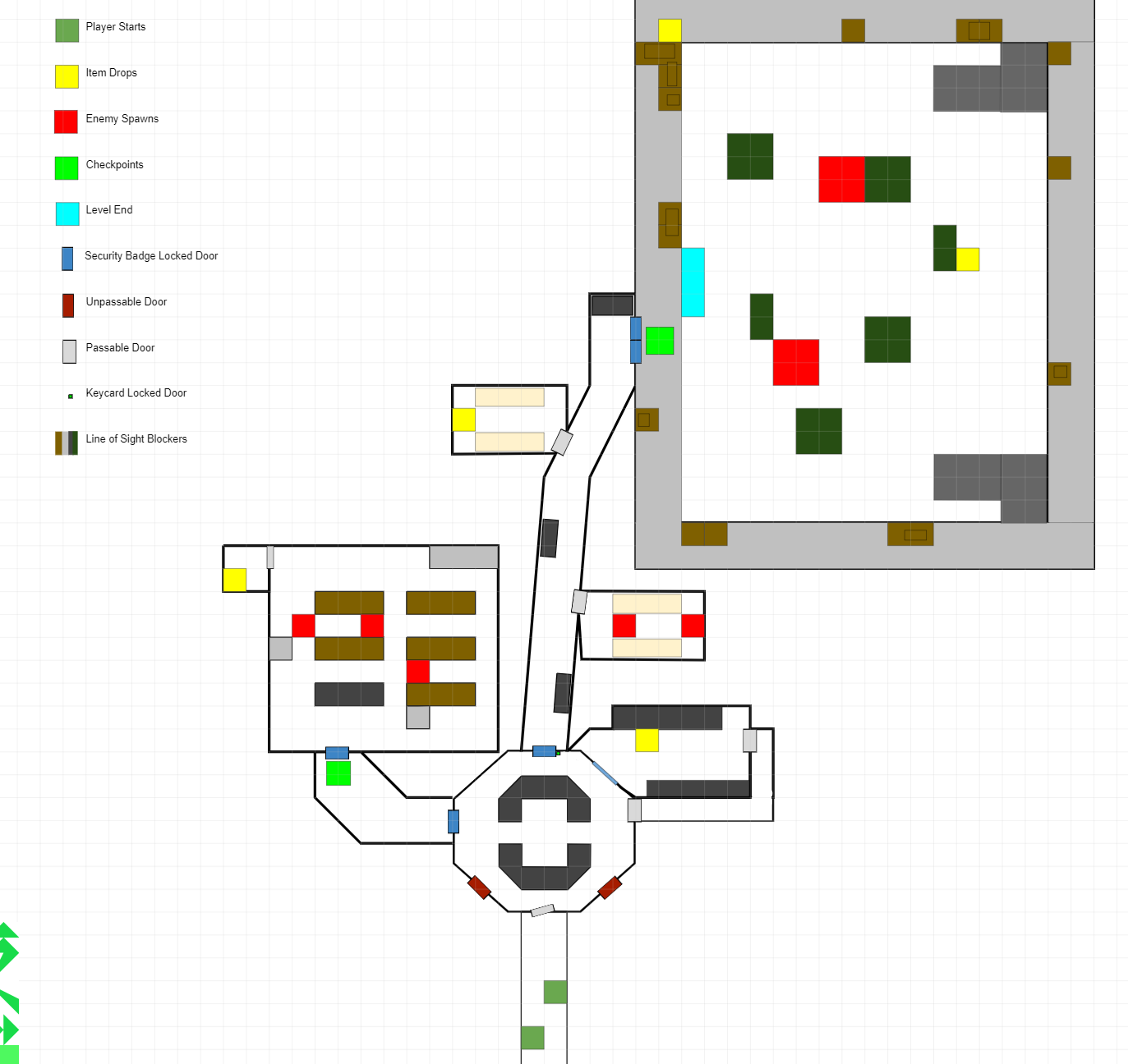
Maybe I’d start with having the player hide from a tough alien enemy before they’re able to get their equipment and blow it away. Maybe I should’ve had a tough, pre-boss enemy in the hallway that maybe the players have to backpedal from in order to defeat. Overall, I think the idea would be to take the movement players may get in a branching level, and force it with encounters within this linear level. That way the space would feel more dynamic and engaging, as the players are forced to engage with the landscape more.
Overall I wouldn’t say that the level was bad (except the bosses at the end, but I was still experimenting with the new ruleset and the amplified nature of it). It flowed correctly, the players didn’t break it, and it was almost within the restrictive 20 minute time limit that was set out. However it was far from a great level, it didn’t have that spark that I feel I achieved with my last one. The map was far less interactive, the enemies were predictable, and any “options” were lackluster. I think simply changing how the enemies interact with the player, and forcing the player to move into different areas would do a lot to help the map, and maybe, just maybe, push it into being a great map to play on. Guess we’ll have to do some more playtesting to see. Oh darn, how unfortunate, having to play games to make better ones, however will I force myself to do it?
Simple DnD Map V.2 Playtest
Due to time constraints that the level was under, I had to cut back on some of the content of the level without making it feel too barren. I knew I was going to be playing with the same group of players again, so I also was pretty sure they were going to take the path opposite of what they took last time. I really liked the dynamism I had going on the left side, so I removed a few of the enemy spawns from that side, and also all the enemies from the right side. Then I placed a singular, beefy guard enemy on the right side in hopes of making the enemy count low, but still give some good battle time for the players. One of the other changes I made was to the boss chamber. It was kind of empty, and I wanted to fill it out more. I knew this was supposed to be a throne room of sorts, so I decided to make a big throne, facing the front of the building, and blocking line-of-sight when entering from the back (like the players would be doing). These changes all ended up succeeding with the goals I had set out, which was great! The party moved through the locked door, clockwise around the building, almost missing the locked door but going back they got it along with a new compatriot.
Version 1

Version 2
When they made it to the main chamber the tension was definitely there. With their sight blocked by the throne, they had to make their way into the arena and around it in order to see what was inside. When fighting the boss, they liked the Roar ability it had, reducing armor in an AoE and forcing players to play outside of it a bit. I think the fight was an appropriate length, not too short, not too long, with a bit of threat. However, I think I should’ve moved the boss around a bit more, making use of the space. It was cool when the players backed up after dealing with the Roar, but afterwards it was just standing and hitting each other until the boss was finally slain. That being said, the time for completion was pretty spot on, landing at right on 20 minutes once they exited the building (which was made short because they got the key to the front door, reducing the backtrack time to nearly nothing).
While the new level met all the requirements set out, and was pretty fun by the player standards, I think there’s still room for improvement, specifically on the right side. I think I need at least one more enemy or one more event of some kind on that side. Maybe the pathway gets blocked off and they have to go the normal route around, maybe I have a goblin guarding the door that runs away to get his big brother guard to come and help him. I don’t think an item drop would accomplish the same goal, as while it gives more meaning for the player to be there, I don’t think it gives more interest in playing through it.
I’m thinking it might be cool if I had the boss interact with the space somehow. Maybe he hits a wall and makes part of the ceiling crumble there, or blows out a wall. If he was more of a demon I’d probably have him shoot fire into the hallway somehow, that’d be cool.
Now for the last requirement, this being a tutorial level of sorts, did I accomplish that? I gave opportunity to jump/float in the front door with the spikes, lock picking was available in both hard and easy locks but both were on the right side, so I suppose I could give one of the doors on the left side a lock as well to ensure that is taught there. Combat was present no matter what, healing is RNG based as to whether the players needed to or not but more than likely they’d do it at some point. Considering all of that, I think the level does well as a tutorial level and teaches the player all the different aspects of the game there are to play and learn. I also think by adding the ability to gain another party member that possibly has a skill that’s lacking in the current party, that ensures that I as the designer, can add in that last bit of healing or ranged combat that maybe wasn’t present before and at least expose the players to it without forcing them into choosing two specific characters.
Simple DnD Map V.1 Playtest
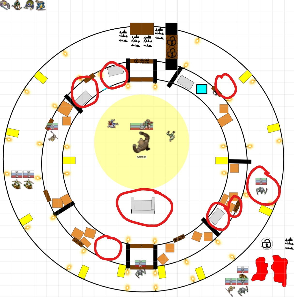
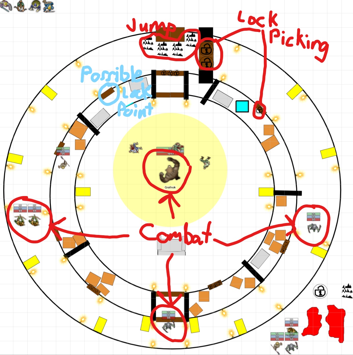
For this map I simply wanted to execute on an idea that came to me about heading into a dark, scary temple where you moved around the outside in order to get access to the central chamber where some horrible boss lay in wait. I liked the idea of making it a circle first off because it was going to be a much different style from the rest of the maps being made but also second because there's inherent logic to a circle that if you follow the outside edge, you end up back where you came from, which makes navigation for the player easier to implement. I also knew I wanted to push the players to go around in a certain direction and place something nice for them if they happened to complete the whole loop before entering the boss area, so they don’t feel like they got swindled out of time for confronting all the other enemies. After setting up the initial size of the building, making the rooms, and having a few enemy spawns, this is what I ended up with.

All the pieces on the lower right were for my ease of access for copying and pasting, and aren’t a part of the map layout. I ended up adding a door to the very front (top side) of the main chamber because I thought it would make sense for a building like this to have immediate access, normally. What I didn’t realize right away, was that by showing the players this door, but not allowing them to go through it, it not only showed them what the door on the opposite side would look like, but that there was some sort of locked room towards the center of the structure, keeping them looking out for another way into it.
Another aspect I added after the initial draft was the golden statues littered around the outside of the temple. I realized that I had placed ranged units to be the ones most likely to be encountered first, and no strategy for the player to use besides run towards them or run away. Adding the statues gave players a place to hide from ranged attacks, and thus a third option in engagement.
Next I want to talk about the events I had planned for this map, and the way they would add a much more dynamic element to the gameplay. First, I’ll show you what I had in store for the first left quadrant.
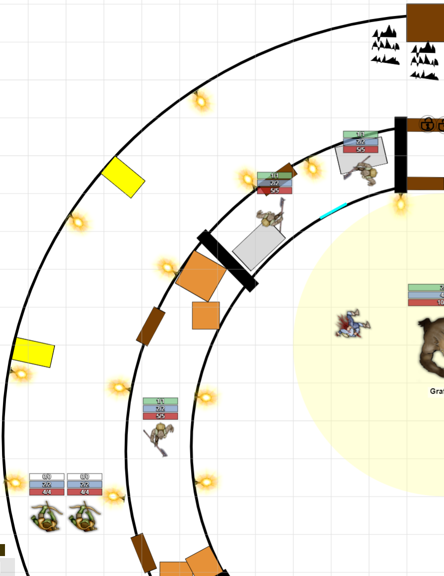
You’ll see that I put a couple of rooms on the inner side of the walkway filled with enemies. The first room the enemies would only initially trigger if the player walked into it and “woke” them up. That would then cause the ranged units in the hallway hearing the fighting to throw down fire traps, forcing the player to move through the side room to get around them (the red splotches were the fiery areas I would’ve placed down). However, if the players didn’t explore the first room and simply walked down the hall and engaged the archers, I would then cause that fighting to “wake up” the enemies in that first room, thus blocking them in along with the enemy in the long room coming out of whichever door seemed appropriate at the time.
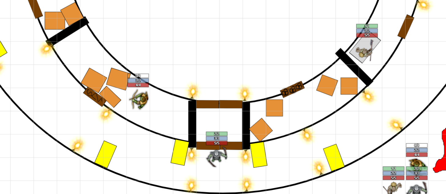
The main event of the bottom half was this guard at the bottom. He wouldn’t leave his post to chase the players, forcing them to engage with him in order to enter the main chamber. He’s got pillars to either side to duck behind to avoid getting cheesed from range, and has much higher stats than the normal enemies, giving the players a little taste of how difficult 3 armor is to get through before getting to the boss that has that high armor value.

The right side, upper quad is where I added, what I thought, was the fun bit. The blue square in the locked room represented another player character. I’d choose at random one of the characters that the player’s didn’t choose and stick them in that room. Once the door was unlocked, that player would join the party as a character I controlled. Not only did I think this was a fun way to give a bonus, but it also meant I could push the boss’s stats just a smidge harder and know that players could possibly get this third member. Even if the third member makes the boss easy, it still would feel like a triumph because you’ve saved a friend in the process which feels even better!
Playtester Feedback
The two players I had playtest this level unfortunately weren’t able to complete it in the time we were allotted, making it only halfway around the circle and killing the guard before having to move on. However, they had a very positive response to what was there! They went down the left side, opting not to try and open the door on the right side and went straight to killing the ranged enemies. They really liked the way the enemies streamed in at them, giving them constant threat even if they were dispatched relatively easily. They liked the round aspect of the level, giving it extra interest, and they also liked the golden statues placed around to give a bit of cover. They liked the idea of the extra player character they could’ve gotten (who wouldn’t?) but they weren’t able to experience that like I had hoped in the playtest itself. There weren’t any negative comments, but a side note I have for myself is that the dungeon was too short, in my eyes, to achieve the emotional response I wanted to evoke of the creepy, scary temple. Of course, that doesn’t fit into the playtime parameters, so it’s a note I’ll keep to myself for now.
As another note, not all of the rooms are being used. This is because I think in the future we will be able to use items, and so it'd be easy to open those rooms up and stash and item or two in there that the players would want. Just a little planning for the future I could do without adding much more effort.
Comments
Post a Comment