Out of Ashes Sprint Reviews
Out of Ashes Post Mortem
It’s something amazing to be able to look back on this project starting out with cubes and docs and see where it has landed now. It has sounds, levels, multiple materials, FX, animations, and it feels pretty darn good to play. It’s not without its bugs, it didn’t get everything I was hoping for, and it didn’t really add any +1 design but it’s a game and I’m pretty proud of it. Overall, the game’s production stayed very consistent and didn’t need to backtrack all that much and as a lead, I’m especially proud of that.
Obviously, as with almost every game ever, we did have to cut some things out. Enemies never made it in, so stats like attack and health never were needed and invasions never happened. However, we were able to pivot away from enemies earlier enough that we didn’t actually spend any time doing them. Cards were assigned, but never worked on, so that’s a big win for the efficiency of production. The resources however, did have a bit of work done that had to be walked back.
Originally there were 7 resources that were going to be in the game that the player would have to juggle different robots to and it was cut down to 3. Some UI work had been done and some programming had been made assuming those 7 resources and so that work did end up getting cut out. What was good though, was that most of the implementation of those resources had been done in a way that was easily repeatable and thus, easily removed and not very much time lost in trying to get those worked out.
One thing that I as a lead thought wasn’t taken care of sooner was double checking the physical code that was being submitted for quality assurance. One of the team’s code had to be almost completely redone because it was written in a poorly optimized way because I did not specify with them what the code requirements were going to be for this game. Because I didn’t tell them I wanted the code done in a particular way and also didn’t check their code after they submitted cards, it cost the game quite a bit of work as we had to go back and work on that. I think it would be good for me as a lead in the future to further state what my expectations will be for things like code and its optimization so that more time can be spent farthing the game instead of updating it to standards.
I also wish I had added a 3D artist to our midst to make up the models for the game. I’m not great at them. I can do it, and it worked out for this mobile game all in all but a dedicated 3D artist would have been able to pump out assets a lot faster than I would have and would’ve given the game much more life in it. As well, I could’ve then focused to more of the programming needs, like enemies for example, so that the game could’ve been more fleshed out an experience.
As well as a designer, I wish I had the idea earlier of what I wanted to do with the resources I gave players. I knew I wanted them to have a limited amount of them, that they’d have to use them to make buildings and thus make more money, but I feel I should’ve sat down and analyzed what I wanted to make the players do in the game to gain those resources besides just waiting for them. If I had sat down sooner and done that, I would’ve realized sooner that I could’ve pivoted the design into something that was much more interactive and fun, that is: clearing land to gain resources and then using those resources to build buildings. Would’ve added so much more interaction between the player and the robots and made the resources feel precious and hard earned instead of the infinite plume they are now.
Overall, the game’s production cycle went very smoothly, and I think my team agrees that it was a pretty painless process and the game still turned out pretty great. Still, it’s good to look back on the process and realize the little things I could’ve done better, differently, so that maybe the next game, it’ll shine all that much brighter.
Sprint 6
For this sprint, I moved into more sprite work and overall trying to make the game look and feel better as we get to the end of this project. I worked on the main screen, the UI layout, and even spruced up an animation.
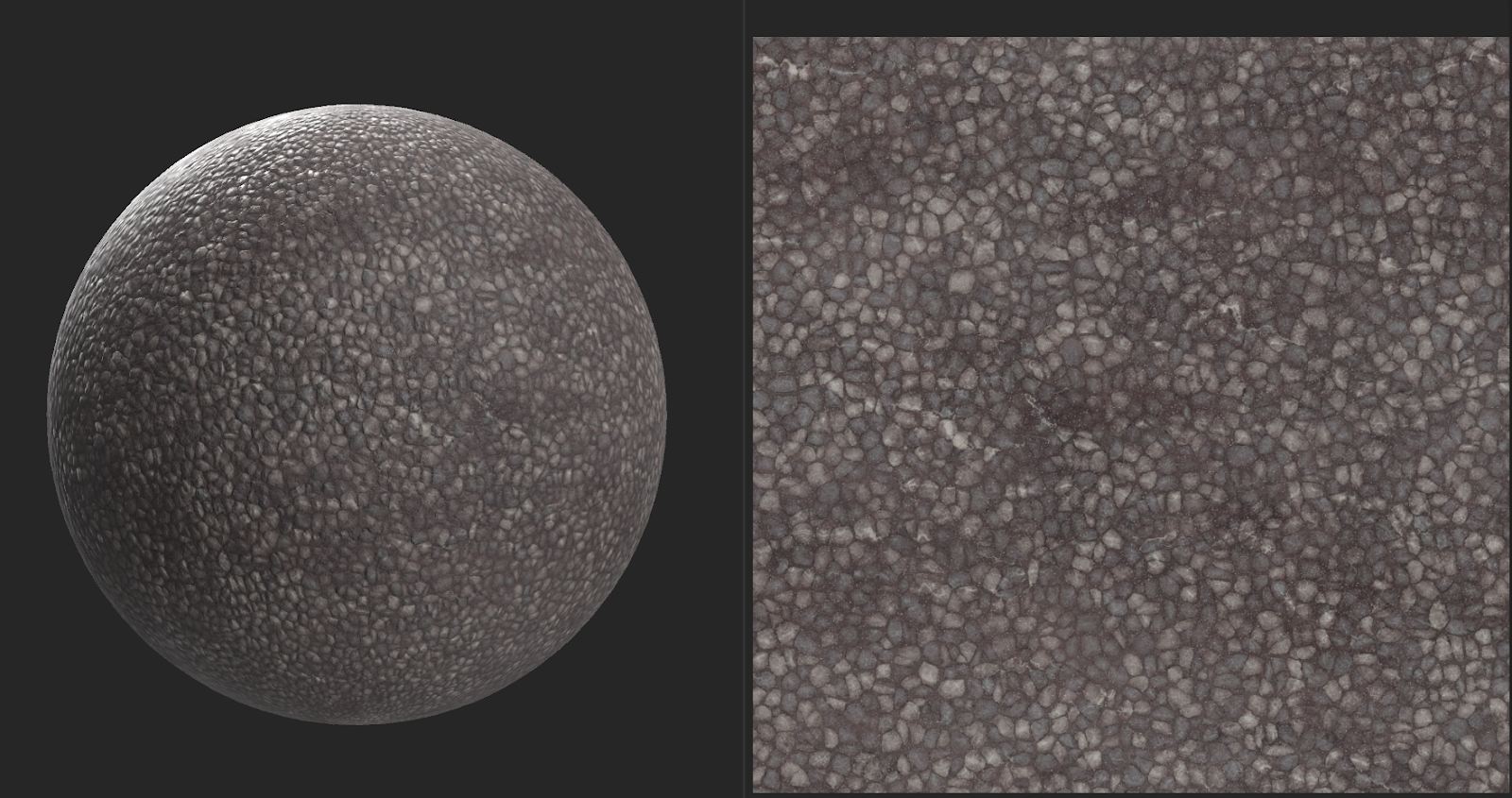
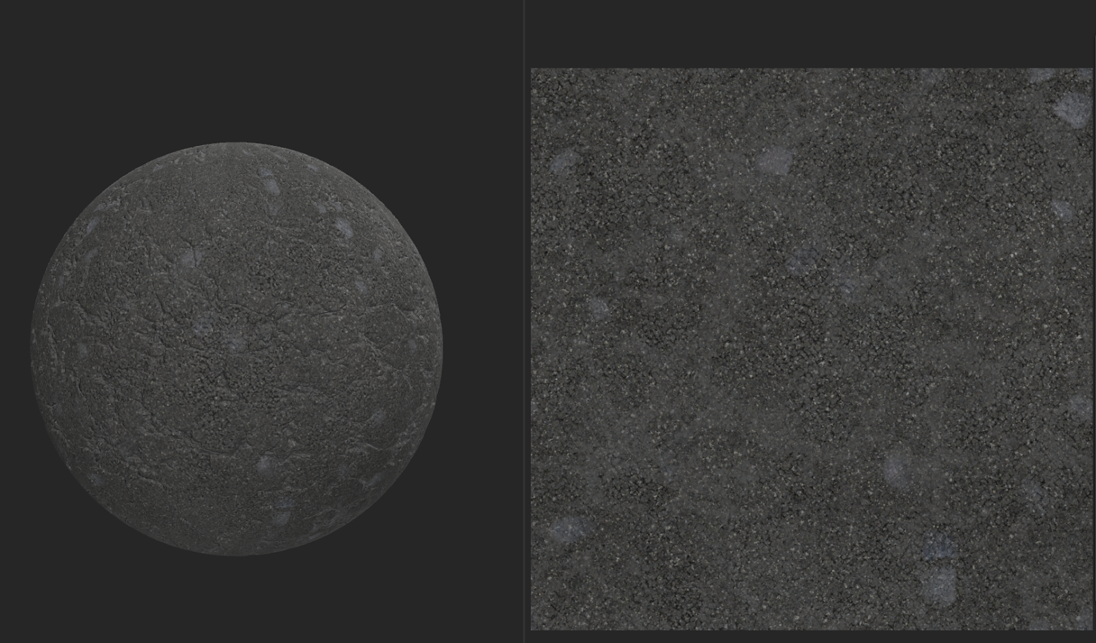
The first thing I did was make a couple more textures for us to use on the overworld map so that we weren’t just dealing with grassy bits. I needed to make both an asphalt texture as well as a gravel texture so that we could have streets as well as gravel areas where maybe concrete has dissolved or the ground is more rocky. To do this, I opened up Adobe Sampler, because I know that software to be incredibly easy to use to make tiling textures with many degrees of detail. From there I made sure the textures were tileable, and then started adding materials and filters. For the asphalt I added cracks, some spottiness, a little dirt, as well as a sandy, gritty, looking material changed to black to simulate the asphalt look. For the gravel, I did a lot more messing with numbers and sliders because there actually is gravel in the program, but it’s more for scattered rocks. So I had to adjust the scale and density as well as play with the height information to make it look like a lot of gravel piled on itself and not just a few scattered rocks.
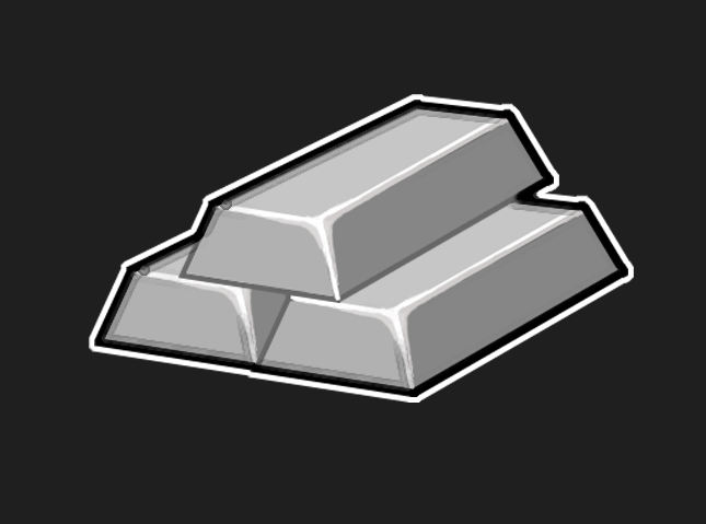
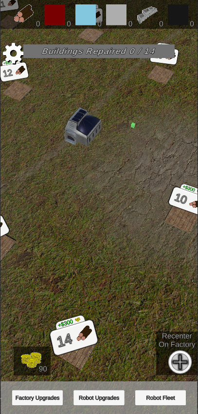
The next thing I worked on was the final icon of the game, the metal icon. Originally, there was 3 more resources that were going to be in the game, but to scale things back, we changed it to just 3 to make things simpler and easier for us and the players. For this icon, I knew I wanted to do something like metal ingots because they have a very recognizable shape as well as a very simple shape I could duplicate. I started off making just a trapezoid shape from lines and then filling in grays to make the shading. From there, I then added some highlight lines along the facing edges with some extra rounding on the upper corner to make it look softer and not as sharp an edge. From there, I duplicated the ingot three times, stacked them up, and added a black outline followed by a white outline so that the icon could stand out in both dark and light backgrounds.
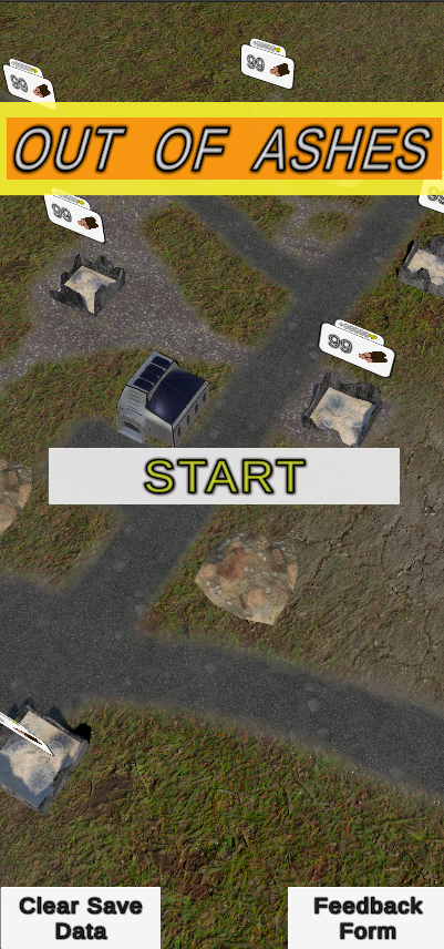
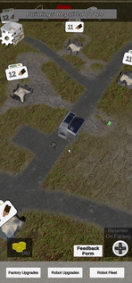
After that I did a bit more redesigning of the main menu screen so that it wasn’t just a blank white and gray screen. I was considering adding a few images to the screen, making something up on photoshop, chopping together screenshots until I got something. Instead, I just took out the background that was covering the game, showing the game screen behind the opening menu. This to me made it a lot more interesting and engaging upon your first opening of the game. Next, I remade the title at the top so there was some color that popped as well as the game title being a bit taller, colored the start button the same yellow as on the title background, and moved the Clear Save and Feedback buttons to the lower corners, more out of the way of the game. I’m not crazy about all these changes. I think the menu looks better now than it did before but it still doesn’t feel like a “good” UI. It’s not super engaging, feels like the colors aren’t quite what they should be, and maybe the scaling of the start button a little differently, I’m not totally sure. I’m not a UI artist but the designer part of my brain is bugged because I can’t put my finger on how I want this main menu to look.
The next thing I worked on was making my animation for finishing buildings. It was okay before coming down and showing that you had progressed, but it wasn’t very flashy and didn’t do anything else really. I wanted to make it pop and feel rewarding. So, I decided to add a little size pop as it finished moving down that happened to line up perfectly with the sound cue that one or my other teammates had finished earlier. Combine that with the UI scaling down as it went up, it really felt like it was in your face congratulating you on finishing a building and I thought that was an awesome feeling! I’m really happy how much a simple animation like that made me feel so much more rewarded as a player and really got me thinking about how much animations and movements of UI help make things feel good.
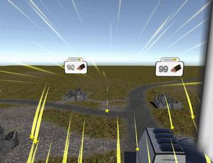
Next up on the feel good train was this VFX I made for finishing a level or “Repairing a city”. I took some inspiration from things like Angry birds and other level based mobile games to get the star explosion and the radiant light lines. This wasn’t too hard to make overall. Even counting the time to make the star texture to be used, it is overall a very simple effect. However, UI VFX are difficult because of getting them implemented to look right on the Unity canvas. They need a special way to be presented so that they’re written over the UI instead of under it like with most everything else in the game. We don’t have the levels implemented yet though, so I’ll have to wait until the next sprint to see if we can make it happen.
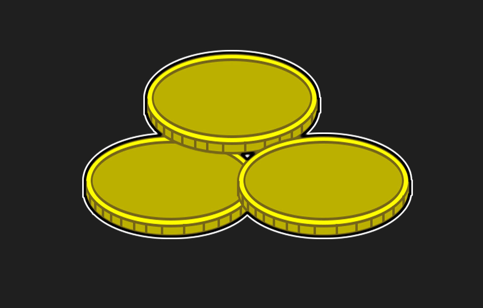
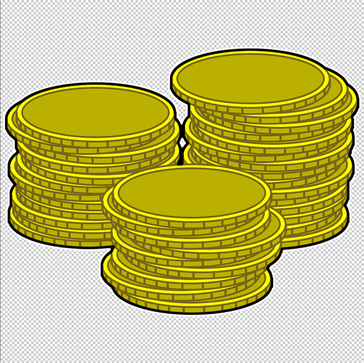
The last thing I did was update the currency icon I had made. I had really liked the earlier icon I made with the stacks of coins because I thought it felt nice and real the way they were stacked and how they were slightly offset from each other. However, looking at it in the game, at the scale that it would be viewed, the lines on the sides of the coins made it look very messy and hard to see clearly. So, I changed the design, relying now only on a few coins to give the general idea of money instead of stacks of money. I do wonder if I could’ve maybe changed the lines to be thinner, maybe a slightly lighter color to blend in, and maybe then I could’ve kept the stacks, but I decided to go with simplifying the way I know how instead.
Sprint 4
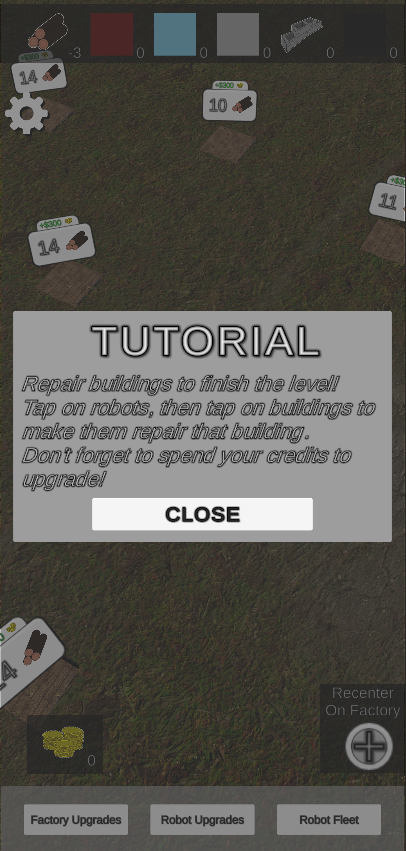
For this sprint, I made a transition from doing 3D art to doing 2D art. The game needed some icons, some effects, and a tutorial page to help guide the player and give them some orientation on what they’re supposed to do. First to start, the tutorial.
For the tutorial prompt my programmer actually set up a handy way to make it appear and appear at the right time… I just needed his help to finalize it. It was a new take on the event system I’m used to where I could give it the text it needs and it’ll pause the game with this panel that appears with your text. After I got his help in triggering the event at all we figured out how to make it pop up only when the player doesn’t have any save data for their game which I thought was a nice touch in not annoying recurring players! The tutorial is simple because the game is ultimately simple right now, so that was easy enough to come up with.
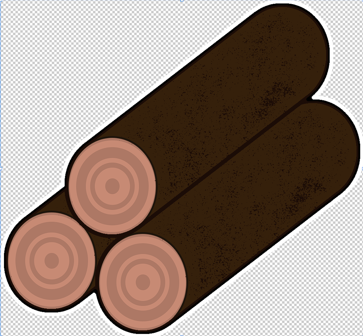
The next thing I worked on was icons for the game’s various resources starting with wood. I first started by making the general log shape by making two circles and connecting them with lines. Once I had them colored in I added more circles to the end to make the rings of the tree. Then I used a splatter brush to give the logs a little more detail where the bark would be and duplicated it a couple of times to make a stack. Took me a while to figure out how to fuse the shapes together so that I could color them properly, but it was a good thing to learn. Once everything was in place I made sure to make a black outline followed by a white outline outside of that the icon could be placed on dark and light backgrounds and still have a good, defining outline.
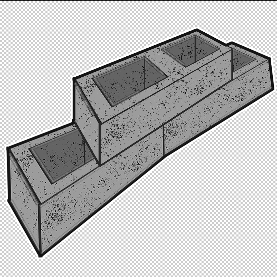
The second icon I worked on was for the concrete. For this one I had to scout around first for inspiration on what a concrete icon should look like and settled on concrete bricks because they were repeatable, simple, and recognizable. This one was kind of hard to make that perspective look on as I couldn’t get the rectangular shapes to align how I wanted them to. I tried their 3D option, different scalings, researched weird tilitings, and I eventually just used asymmetric scaling to get the look but it ended up making the blocks a lot harder to stack because the look was too much perspective. I lined up the blocks so it at least looked more normal but it still doesn’t look quite right to me. I made sure to finish with the outlines like the last icon as well as the details splatter to make it feel a bit more interesting to look at.
The last icon I worked on is the currency. This one was interesting because I had to figure out what a cartoony coin could look like and how to make that myself in photoshop. I eventually stacked ellipses and manually drew lines in between them connect them and used a couple different yellows to try and convey some details. I then stacked all the coins on top of each other to get the fun stacks you see above. Unfortunately, they turned out to be a bit too detailed, and come out looking a bit muddy as the in-game icon goes. I may have to revisit this icon later to clean it up and make the details not so small.
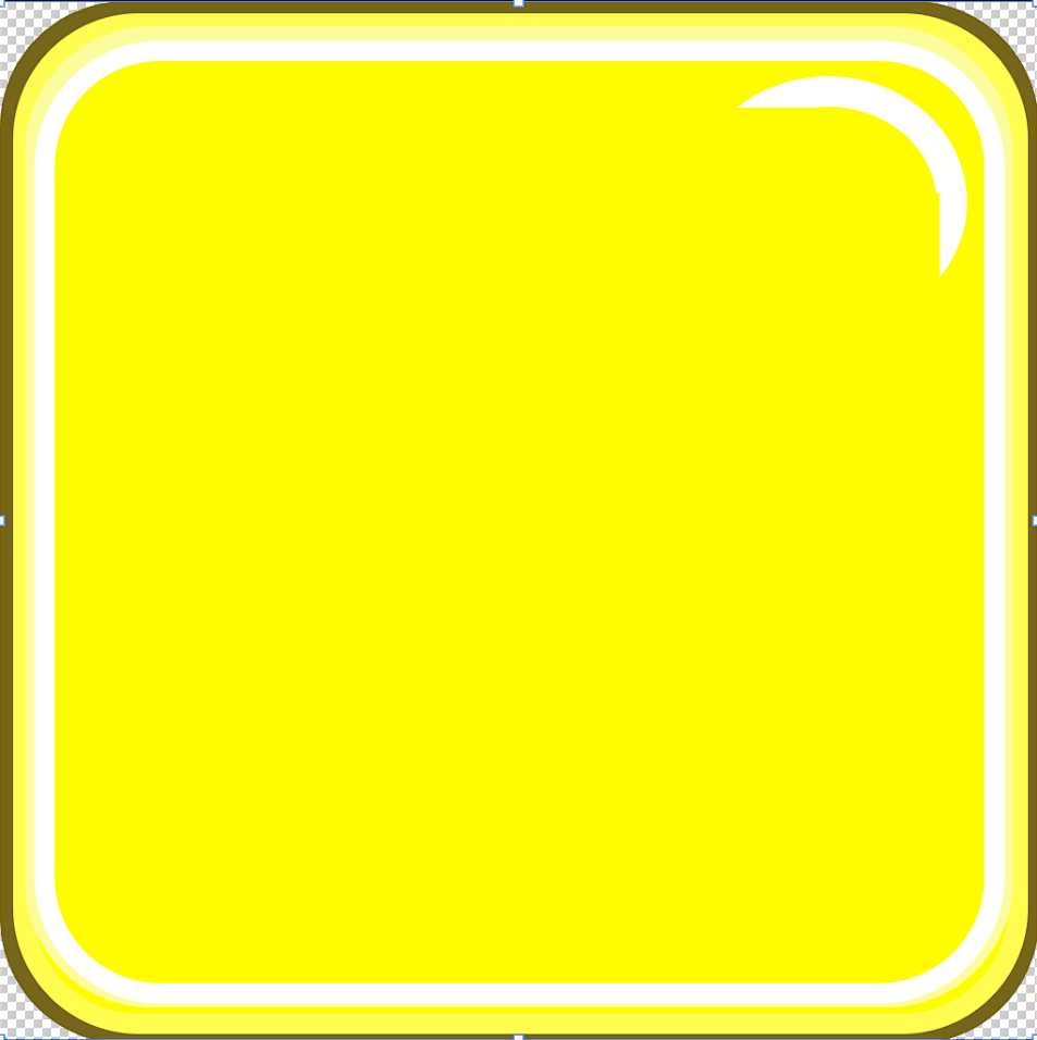
The last 2D art I did was making a texture for the upgrade buttons in the game. My programmer told me to make it a perfect square because that allowed him to slice it into 9 pieces and tile the texture across whatever button size we needed. I wanted to make the button feel rounded to help the more cartoony aspect of the game as well as a nice, bright yellow as is typical of most good things to click on in games. The touch I really liked was the little shine in the upper right hand corner that I made by overlapping a couple of spheres and a couple of rectangles so that it got a similar curvature to the outer edge. I think it adds just a bit more flair and fun to the button and the illusion that it is bigger than it seems.
The very last task I did for the sprint was to make the numbers on the screen a little easier to read. I did this by adding a black background to them that was slightly transparent so that they had something darker behind the white numbers that helped make them pop. It’s pretty simple, but I think it’s really effective in getting that text to shine through.
Sprint 3
Yes, yes, modeling and texturing was done. Got the factory done so the robots have an actual place to go to and from with their supplies, also finished a couple more hands and robots so that we can start having the different material types. What’s more interesting to me this sprint was analyzing the playtests that were done with the game and how I want to see the game change from here. First, we’ll start with the 3D art.
First object I modeled was the concrete hand for the repair bots. For this I wanted it to be a jackhammer because nothing to me says “works with concrete” than a jackhammer. I wanted it to look a little more used than the other hands as concrete is kinda rough-and-tumble. I also added the black and yellow striping to the base of it because while I could’ve kept it a solid color and kept it more true to what a jackhammer is, the black and yellow speaks more to the construction aspect which I think is better than trying to take a low-poly jackhammer and assuming people will understand what it is.
I think this hand could have definitely been better but I just can’t put my finger on what exactly I would want to do differently. It’s low poly, and it’s meant to be low poly, but I feel like I still could’ve made the texturing more interesting in some way. Maybe some icon on the side, some scrape lines on the hammer part of the jackhammer to make it look like it’s been used to strike things, or maybe I need to change the metal texturing I did in general. All 3 maybe, I just can’t quite put my finger on what exactly I dislike about it.
This next hand was hard to figure out a concept for, the Iron handling robot hand. The biggest problem for me was that there will be a Steel handling robot and I needed to make sure the two were different. I looked up a lot of tools involved with smithing to try and figure out what I could put here, and after a lot of deliberation I ended up with a combination of the tongs I was seeing, that were big and curvy and I thought could be a good contrast. However, to add a little more to it, I added a little bit in the middle where a torch would be, in my mind. Now that flame is something that I wouldn’t want to model, that’s something that I think is better fit for a VFX or even just a simple Unity point light, but I think between the two it’ll still seem like metal work, but rough metal work, unrefined. That’s the difference that I can use later on to make the Steel robot stand out, some cleaner, more refined look. I like how the texting came up for the most part except I wish I had painted more around the ends of the tongs where the heat would be most intense. I think if I would’ve added a bit more there, then it would’ve really shined as a texture and not look as generic as it does as far as the wear and tear.
The last model I worked on was the factory. I had a lot of trouble figuring out how I wanted this one to look. I knew I wanted it to look futuristic in some way, but not sure exactly how I wanted to pull that off. I looked around at a lot of pictures of different “futuristic factories” and came around to the idea of lots of glass and polished metal. I also liked the idea of a big garage door where the robots would go in and out of. I think the model I ended up with worked in a lot of ways and not so much in others. I think the metal was good, it was the right kind of clean, polished that looks futuristic.
However, it’s lacking a lot of details. I think it needs a lot more little details. Lines, maybe people doors, smaller windows, something more to give it more to look at. The second was the glass, which I liked the placement of the windows, the half dome, and the panels on the top of the factory but I think the glass is too dark. Looking back on it now I think it should be lightened up to fit a nicer aesthetic. The dark glass just looks too ominous like bad things are happening in the factory.
Something I am very happy with is my linework around the outside edges of the factory. I think those black lines help to give a lot more shape and form to the building that otherwise looked very formless. One thing I wish I had done a little differently was to make the lines on the bay door smooth to help sell the illusion of it being round instead of going by the geometry lines. Looking back on it now I have no idea why I did it that way instead of figuring out a way to make it round on top.
This is a slide from our sprint review and I’m putting it here because it’s the best way that I can sum up the playtest. The game worked and had some good, interactive features, and players loved buying upgrades just to buy upgrades and watch the numbers go up. However, there wasn’t anything telling them what they were supposed to do. It was great to see that we had something that was engaging, and a lot of players thought the feedback for the buildings coming up in stages was a nice touch to such an early alpha build, but there was pretty consistent confusion on what the actual objective of the game was.
So for this next sprint, I decided I needed to halt the enemies part of the game, out +1 to the design, to focus more on the core of the game, the idle portion. This coming sprint I’m going to direct the team on tasks that help to make that experience feel better, more intuitive, and make sense. That means more UI prompts, VFX and SFX to help guide the player, quality of life changes like a sensitivity slider for moving the map, and giving more variety of buildings for the players to repair. I think this will be a better way to go moving forward and will make for a much more polished and enjoyable experience overall.


Sprint 2
As will be for probably all of my sprints for this game, I did some modeling and texturing. This time around though I tackled some of the more important parts of the game which are the buildings and the robots. I had to do some brainstorming on how I wanted them to work so we could get the most mileage out of our models but after some talks with the team I think we figured out a good place to go with it.
The first thing I decided to take on was the repair drones. These are going to be the robots the player interacts with the most but also will have many different types that the player needs to accomplish goals. What I decided on after looking at a lot of robots was a rounded robot type that to me spoke more to the idea of it being a repair drone because it doesn’t look as threatening or combat focused. What I also decided was that I could change the arms of the robots to fit whatever material handling type they were. This way I could keep the same drone base but still input a little character to the drone to make it different from other drones of different types. This first arm is going to be a saw blade because it’ll be a wood material handler. I’m planning on putting a picture of a saw blade on there and making the background transparent so that I don’t have to spend all those poly’s on a real saw blade.
For texturing the robot I also had an idea of adding some emissive texturing to the body. By making it white, we can multiply that color with any other color and get whatever color of stripes and dots we want, providing the player a very easy way to see the differences between different robots and what they handle without having to make any different textures from the backend. While it would be nice to have different textures per robot to further add character to them, I’m the only 3D artist, and I still wouldn’t call myself too terribly good, so I’ll take whatever shortcuts I can get away with at the moment.
The next task was to make the first simple house. However, it wasn’t just making the house, but I needed to model it so the building could be made in stages, allowing the player to see the progress their building is making as they build it up. After toying around with the idea of some ruined kinds of buildings that eventually look like a fully repaired building, one of my teammates came up with the idea of just putting scaffolding around the spot to help show that repair was in progress. I thought that was a great idea! So I went about modeling a simple, one story house to start with to get the footprint of the building, making sure that the walls and the roof were separate because they could be used to show stages and then made up the scaffolding around the house. Like with other models, I knew the texturing would be where I’d want to put more of my effort and details because that doesn’t add to the game’s poly count.
Texturing these buildings was kind of interesting because unlike most other models where the edges of the polygons made for great edges to masks, I didn’t want to add in quads just to have separated places for doors and windows on the houses. Because of that, I had to paint in the masks by hand in the places I wanted details to go that were apart from the walls. This might be something that’s very common among 3D artists, but I’m happy with what I was able to come up with. Once I had the base house done with textures that fit a concrete and wood house, I decided it would be good to take that base and make some slightly different houses, sense I had already put in the work of making the masks already and I’m glad I did because it’ll make the game have so much more even in just three slightly different looking buildings than if I had stuck to just one for all the small houses. I also liked how my scaffolding texturing came out and I think the yellow makes it feel much more like a construction zone and pops out from more of the grays and browns that I’m sure will fill the post-apocalyptic landscape.


Sprint 1
First sprint down and 6 more to go. Being the lead on this project I had a lot to do up front in terms of organizing, laying out the project, and developing the idea into a full-fledged game. It made it a bit more difficult to get actual work done for the project outside of organization but I made it happen; and for being a self-proclaimed programmer, I was actually really happy with the 3D assets I was able to create for the project this starting sprint
As a quick side, I know that these props are some of the least needed for the game. They’re just props, but I wasn’t sure how much time I was going to have to dedicate to modeling and texturing assets so I picked some I could ease into also knowing that I’d need to brush up on all those skills.


This being a mobile game and these being props for the environment in that mobile game, I know I was going for pretty low poly in the models. As well, I knew I was going to want to combine space on texture sheets for props so I decided on doing a batch of four to fill out that sheet. Having made it all the way through texturing now and remembered all the crazy things you can do with it, I probably could’ve made these even lower poly for the most part, but I’m still happy with them. The box I planned on texturing cross sections on the face, the trash can I kept the edges hard because I thought that would look more like a trashcan, and the pallet I cut out two edges below because I thought it might be hard to texture in those holes but after texturing I think it would’ve been worth it to keep that pallet a simple box and save on faces.

The crate I think turned out okay, not the best, But I think it says wooden box pretty well. I’m happy with the rivets on the cross beams and the dirtiness but the scratches I think are too extreme. I think it would’ve looked better to try and make some cracking wood effect, some sort of splintering maybe. The big scratches I don’t think come across and damaged and more confused as there’s different kinds of scratches and I didn’t have a good idea of how to make good scratches.

The oil barrel I think came out a lot better than the crate. I liked how the rust and the dirtiness came out, as well I really like the additions of the normal stamps on the top for the two caps. One thing I am disappointed by is the seam, which is pretty obvious on the model. Looking at it now, I probably should have adjusted the caps so that they weren’t quite on that seam. I tried hiding the seam as best as I could but I couldn’t figure out a good way to completely erase it. I suppose that’ll be something I’ll keep in mind for the UVing phase for my next set of models.

I’m really happy with my normals work on the trashcan. I added the divots in the metal along the sides by hand as well as across the top to keep the lid looking more separate from the can and along the bottom to make it have the appearance of going down at the bottom more. I also added the rings on top and even the handle on the top of the lid. I like the dirtiness of it, the rust, but mostly like the normals work because I think it adds so much to the object.

I’m most proud of this pallet. I feel like I was able to add a lot of layers in all the different effects I had going on. Painting in normals to make it look like separate boards but also painting in the discolored branch marks on the wood. The nails for the boards and painting the black on front for the holes the pallet would have. Part of this might come from me having a lot of experience dealing with wooden pallets for jobs I’ve worked in the past, part of it was learning texturing as I did the other three models, but I’m really proud of it and how it turned out.
Comments
Post a Comment